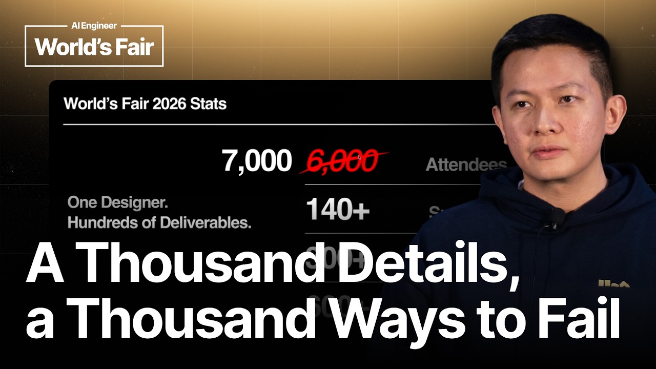
Vincent Wendy handles the design needs of a conference with 7,000 attendees, more than 140 sponsors, more than 300 speakers, and more than 600 sessions by combining reusable design systems with automation.
2
Devin can pull current schedule data, generate speaker graphics, match photographs to speakers, and check large collections of sponsor logos for omissions.
3
Wendy's method is to define the design foundation, reuse it, automate production, validate the results, and remove friction when exceptions appear.
Summary
Vincent Wendy describes how he handles design for a large AI Engineer conference as its only designer. The event has 7,000 attendees, more than 140 sponsors, more than 300 speakers, and more than 600 sessions, with every part needing visual assets. His approach starts with a tightly defined design system covering typography, colors, components, and layout. That foundation lets other teams reuse the visual language and lets automated tools produce consistent outputs. Devin pulls live schedule data into room signage, generates speaker announcements and trading cards, identifies people in photographs, and checks sponsor banners and shirts for missing logos. Wendy is direct about the limits of automation. The work still needs a person who can define the problem, check the result, and handle exceptions such as adding an edit button when a schedule changes. His argument is practical: at this scale, small details create the failures, so each detail needs a workflow.
One designer carries the visual work for a large conference
Vincent Wendy is the senior creative designer at AI Engineer, a company with about 12 to 15 people. He is responsible for design across a conference with 7,000 attendees, more than 140 sponsors, more than 300 speakers, and more than 600 sessions. The work includes sponsor assets, speaker graphics, signs, stickers, landing pages, track mascots, and digital displays. Wendy describes the problem plainly: a thousand details create a thousand ways to fail. A missing sponsor logo or an incorrect speaker schedule can become a visible event problem.
The design system gives both people and models fixed rules
Wendy's first step is to define the foundation: typography, colors, components, and other parts of the visual system. He uses atomic design principles, building small pieces that can be combined into complete deliverables. He specifies desktop and mobile typography because language models may otherwise invent random font sizes. Once the website's branding is defined, the marketing team can create emails, flyers, and documents from the same system without asking him to design each item from scratch.
Reusable designs let one pattern cover many deliverables
After the foundation is set, Wendy reuses the same design patterns across the conference. He gives the mascot as an example of a design that can be repeated rather than rebuilt for every use. The same principle applies to speaker announcements, signage, and other event assets. A defined visual system makes it possible to create one pattern that works across many outputs. This reduces the amount of individual design work while keeping the conference materials visually related.
Live data turns room signage into an automated workflow
Room schedules used to be laid out manually in Figma. Wendy now asks Devin for the latest data for a particular room and day, exports the result as a PNG, and copies it to a flash drive for the screen. He can ask for greater accuracy and connect the workflow to MCP or provide a specification sheet with spacing, font sizes, and other rules. This reduces the feedback loop between design and engineering and makes it easier to produce output that matches the intended design.
Wendy created a speaker announcement tool for more than 300 speakers. A user can select an announcement, change the name, and load a landscape version. When a speaker has a headshot and the required details, the tool exports the graphic automatically. The same system produces trading cards, which Wendy says became popular. He describes the outputs as pixel perfect. The workflow now runs through Slack, Figma, and Devin, with MCP connections or a specification document supplying the visual details.
Image matching removes a manual search through photographer files
For a speaker thumbnail, Wendy can show Devin a photograph and ask who the person is. In the example, it identifies Jason Liu. Before this workflow, Wendy had to search through the photographer's files, inspect possible images, and find the right one by hand. Devin can identify the speaker, download the corresponding photograph, and place it into the thumbnail workflow. Wendy presents this as a practical use of visual detection inside an otherwise repetitive production task.
Visual checks catch missing logos across large graphics
Wendy asks Devin to compare a lobby banner with more than 140 sponsor logos and identify missing logos. He says the checks he ran were 100 percent accurate. He applies the same approach to the conference shirt. The tool can inspect a visual asset and compare it with the expected set, giving Wendy another check before the material reaches attendees. He frames the result as a human and AI review process, since people can miss a small omission during a manual check.
The remaining work is handling exceptions and attendee friction
Wendy says designers should think like users moving through the conference. He imagines the attendee path from registration to maps, wayfinding, QR codes, and rooms, then checks whether the pieces connect. He also says the real job is handling exceptions. When a schedule needed an update and the tool had no edit button, he asked Devin to add one. He could then change the schedule, export a new PNG, and put it back on the screen. His final advice is to think through the smallest things that can go wrong and address them before they become failures.